 |
| 1a. |
 |
| 1b. |
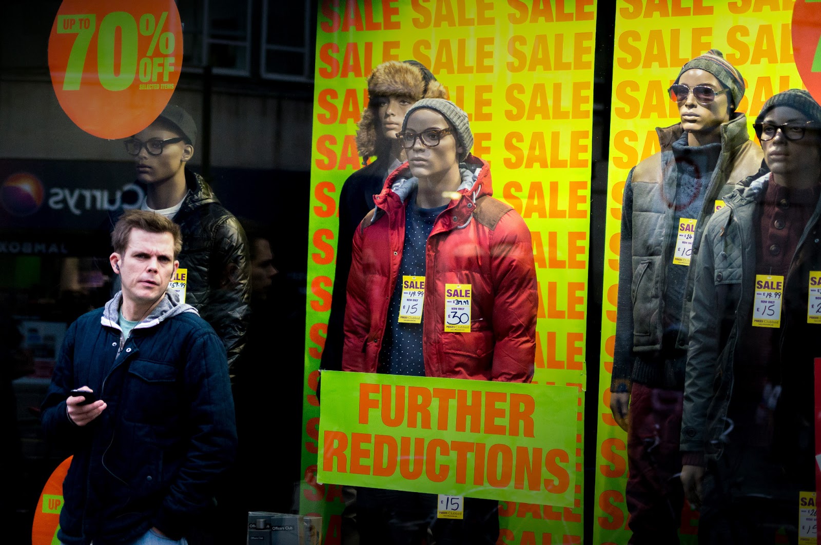
Here I have placed my 'Final Selects' and the reasons I chose them. One, seemingly small but upon reflection, significant alteration to my workflow regarding the 'Final Selects' was the inclusion of crops (usually with a square 1:1 crop ratio). On each occasion I decided to keep the crop along with its uncropped version in case I later changed my mind. An example of this can be seen in the first of my final selects (1b) compared to its uncropped version (1a). In fact I discovered that cropping, especially in the 1:1 ratio, looked like a previously undiscovered
gem for me and I thought it would be interesting to see whether this
carried over in later projects. I could see no reason against this for
uploading to web but maybe issues with printing (compared to a 3:2
ratio). In terms of choosing why to include this photograph in the final selects went, I selected it because it showed an interesting facial expression, which was further brought out by the crop 'closing in' on it.
 |
| 2. |
I decided on another square crop for photograph 2. I would say it worked here because it closes in on the main subject, which brings out more detail of his features, while simultaneously creating less distractions within the photograph so the viewer can concentrate on the subject's intent gaze and the possible link between the two men looking in the same direction.
 |
| 3. |
In the third final select my sole reason it made my final selects was because of the strong and obvious relationship between the two people in conversation. I tried to enhance this by taking out all colour apart from red in post-processing. This was to bring out the two people aforementioned as they were the only two objects with red (apart form the two red buses directly above each person, which I felt further strengthened the connection) in the photograph. I liked the woman's smile as they spoke with the man listening on because it showed the character London can have.
 |
| 4. |
4. was an opportunist moment I almost wasn't quick enough to capture. The concept behind it was that the man in the bottom-left was one of the shop models as well. If I had had more time to take the photo I would have included more of the man's legs and chosen a more head-on perspective as I felt this would have made the illusion more obvious. In an attempt to offset this in post-processing I applied a subtle vignette to the top-left and bottom-right of the image so as to 'push' the model and their impostor closer together. I felt this helped the viewer make that connection.
 |
| 5. |
5. I thought was a creative image that didn't require much processing as the symmetry was apparent there and the woman was smiling naturally. However, I did take several shots of this woman and her reflection in order to get a 'good' shot, for example when she was smiling naturally. So most of the editing for this shot was done in the selection stage inside of the organiser.
 |
| 6. |
In contrast photograph 6 was pretty overexposed so I was glad in this instance that I had shot in both raw format and jpeg. I also obviously cropped it into the square format but most of the processing was done inside of the raw converter. I was pleased with the resulting image as no discernible detail was lost in the man's face even though I had to underexpose the whole image a lot and then push the shadows up to bring back his facial features (which incidentally were the main reason I kept this photograph in the final selects - I thought they were expressive).
 |
| 7. |
The main feature of photograph 7 was simply the full-on glance by the subject. The glance was close to being completely directed at me, which served to make me uneasy, while also, more importantly, provided a better angle of the subject's face, similar to 1b. This was perhaps the weakest of my final selects because of the ambivalent expression but I suppose the red bus in the background gave a sense of place.
 |
| 8. |
Although not as full-on an angle as the last photograph, photograph 8 was still quite direct. I felt this contributed to the sense of a busy shopper on Oxford Street, caught up in all the commotion of shopping. This was complimented for me by the shallow depth of field with everything behind her a blur of activity.
 |
| 9. |
I captured photograph 9 with a 35mm lens and I thought this gave a wider view of what Oxford Street was like, while still providing a clear couple of subjects in the form of the man and woman in the foreground. This image was quite heavily cropped, which helped to show off the relationship between the man and woman.
 |
| 10. |
While photograph 10 wasn't the most creatively taken shot of the selection it was the most creatively processed image. I tried to reflect the classic expression on the man's face by using a classic vignette and sepia colour filter and I was pleased with the result. This was because it focused the attention on the man's face, which was, quite blatantly the main attraction of the image.
 |
| 11. |
11. had to be the most creative photograph I took for the project and incidentally one of the most difficult to process. It had been raining that day so I thought I would try to put to use one of the many puddles on the ground. Again I was glad I captured the photograph in raw and jpeg because photographing people through the puddle made getting the right exposure hard and this particular image was highly overexposed. However, I was able to 'rescue' the image so the person could be more clearly seen. I also rotated the image 180 degrees so there was an illusion she was the 'right way up' inside the puddle.
 |
| 12. |
Here (in Photograph 12) I tried the panning technique on a fast-walking pedestrian and I thought it added some variety to the set. Although the technique of panning wasn't perfect I thought this added somewhat to the feel of the photograph.
 |
| 13. |
Another 'full-on' shot, photograph 13 provided a frank, maybe mildly inhospitable (and understandably so - since he had obviously become aware of my presence) look, which could be seen as 'open' or ever so slightly 'hostile'. In my eyes however, I found it to be the former and was what made the photograph more interesting for me. Photograph 14 followed in this trend but I chose a tighter crop to accentuate the facial expression, which I felt was more appropriate in this photograph as the rest of the body didn't add anything to the photograph.
 |
| 14. |
 |
| 15. |
I justified including 15. in the final selects because it showed a moment right where something was being decided. I could possibly have taken the shot more full-on but I liked the clear inclusion of the map in the frame and the busy street behind them.
I liked Photograph 16 a lot because of the very natural, slightly curious expression on the subject's face and how isolated he seemed, with all the hustle and bustle going on behind him. This last point I thought made the photograph similar to 8. except here the person was looking straight at me. I was a bit annoyed that the subject's face was very slightly out of focus but it wasn't immediately noticeable, which satisfied me.
 |
| 16. |
 |
| 17. |
Photograph 17 was another square crop that I deemed best showed off the subject. It also featured the subject's face looking straight at me. However, what differentiated this photograph for me was the placement of the subject's hands. I selected this photograph from several of the same subject and after some deliberation decided this best showed off his character.
No comments:
Post a Comment